Verjus
Art Direction for newness and familiarity
Context & Brief:
Verjus is a wine bar and restaurant in San Francisco’s Jackson Square, known for its European sensibility, seasonal cooking, and quietly refined atmosphere. Within the Quince family of restaurants, Verjus occupies a distinct position — more editorial, more intimate, and intentionally understated.
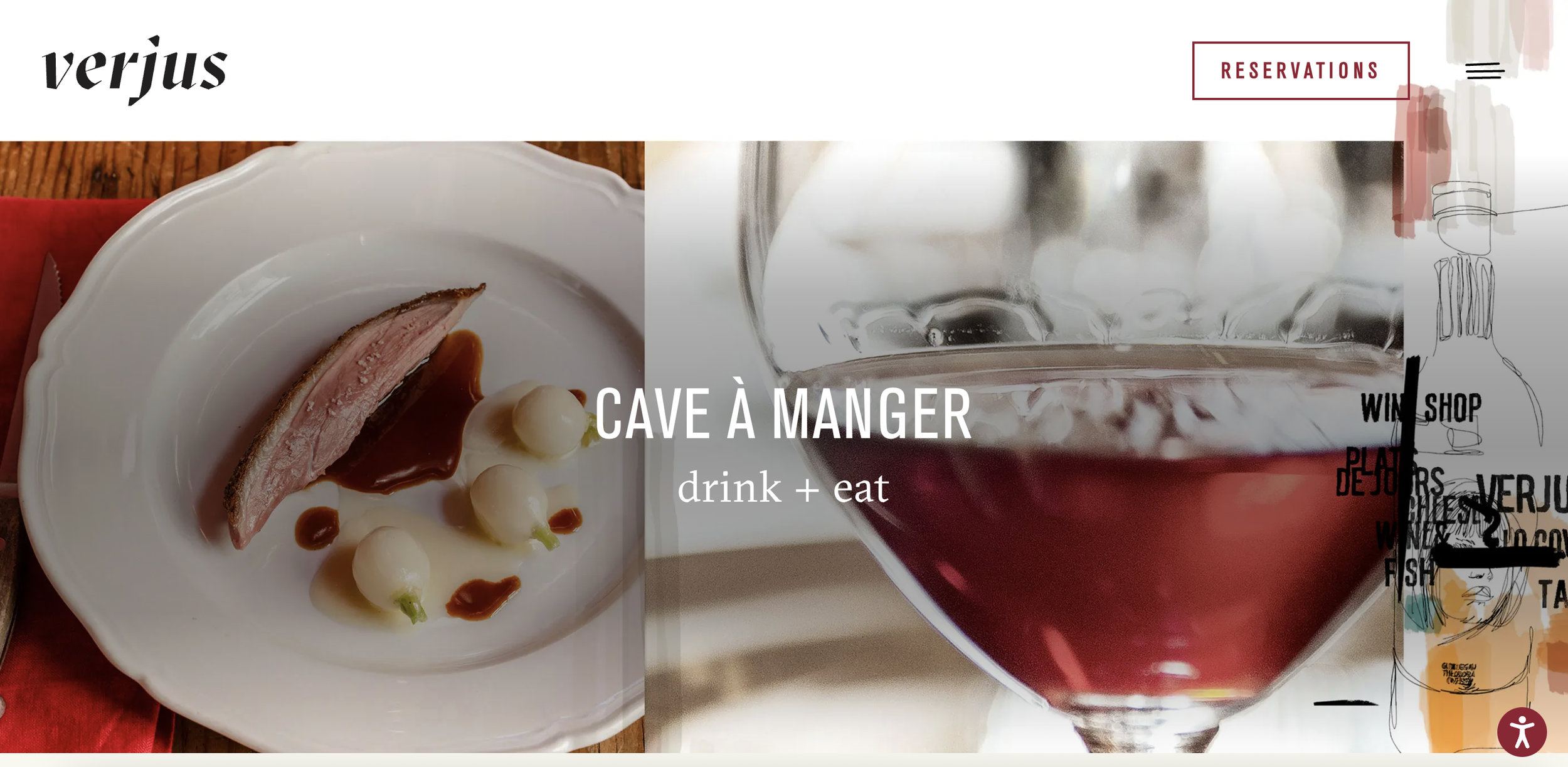
The work focused on evolving Verjus’ visual expression in a way that felt fresh yet familiar. Rather than introducing a new identity, the approach integrated existing elements with subtle shifts in tone, pacing, and imagery. This sensibility extended to an evolving poster presence in the space — informal, lo-fi, and culturally driven — allowing graphic elements to accumulate organically as part of the room rather than function as fixed branding.
Design Focus:
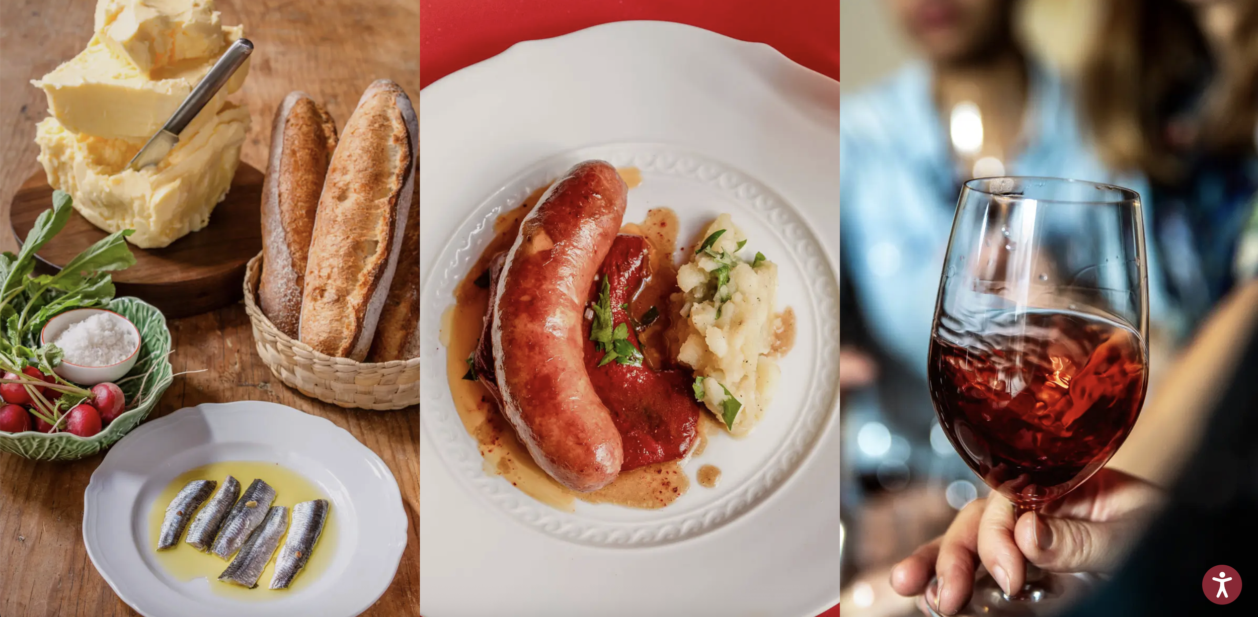
Photography-led layouts that convey energy, movement, and sociability
A visual language that feels youthful and contemporary while remaining restrained
Subtle refinements that distinguish Verjus from Cotogna and Quince while maintaining family coherence
Art Direction | Graphic Design | Website Design


